Industrial Rejoice: BPO BPC Icon Change
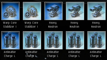
Posted: 2011-05-08 Filed under: industry | Tags: bpc, bpo 7 CommentsOn the test server we now have different icons for BPOs and BPCs. As a person that has worked with Invention, Research, and Manufacturing, I can’t begin to even describe how much this will positively affect me. I have been waiting for this change since I started producing items in Eve in 2008.
 The darker blue icons are BPOs. Lighter ones, BPCs.
Thank you CCP for reviewing such forum posts as Akita T’s Thousand Papercuts thread.

Is About Time
I’d have to see it in game I suppose, but a shade change isn’t enough from the sample image you included. If they can do that, why not include a tag on the top left, perhaps with an “O” or some such?
That is what I thought also. Some sort of tag like the Meta icon for T1/2/3/Faction/Officer. Perhaps it will change — it is the test server after all.
about time too!
While I am hugely grateful for this – the Dump shits at CCP did not take into account that if you are slightly colorblind this makes absolutely no difference.
Where is the Clear Indicator that this is a BPO vs PBC… Something similar to T1 vs T2 I would have thought.
Yeah I thought it was going to be a meta tag that would display a “O” or “C”. Does the horizontal row shading not help?
[…] 1.5 (May 2011), the icon change for BPO/BPCs hit Tranquility and I rejoiced because my industrial life was forever changed. Simple change with a large impact. I believe than […]